Show Season

Custom Designed English, Western and Hunt Show Attire

  • About Us
  • Contact Us
  • Show Schedule
  • Get Measured
  • English
  • All Western Pleasure
  • I Want it NOW
    • English
    • Hunt
    • Western
  • Hunt Coats
    • Shirts and Dickies
  • Side Saddle
  • Pleasure Chaps
  • Saddle Pad Pieces
  • Show Season Clients
  • Meet the Show Season Team
You are here: Home / Archives for admin

Mastering The Art of Photos

July 1, 2013 by admin

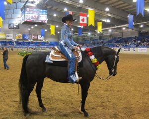
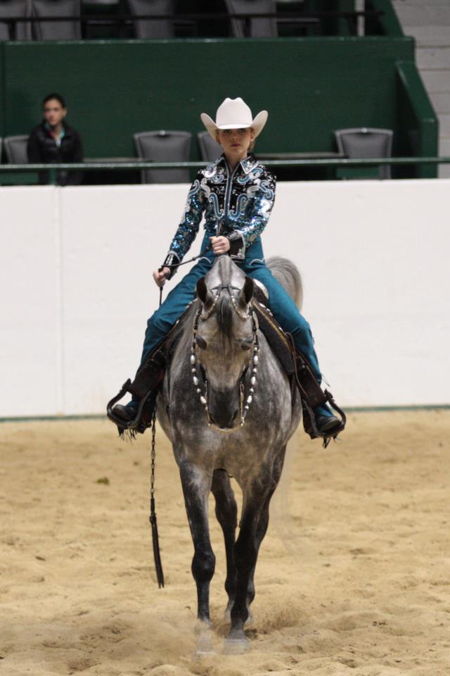
Mastering the art of photos is helpful for all of us equestrian girls who not only want their horses to look picture perfect, but want to also look good themselves.

Although many of us have a tried and true make-up routine for everyday – one that is generally a simpler look – putting on make-up for the show arena is often a little different. “Everyday make-up” wont always photograph well, might not even show up at all, and can often make faces look plain and pale.

As such, Show Season and I are here with a crash course in photo flattery. You will be picture-perfect in no time.

Apply In Natural Light

We have all looked at pictures of ourselves where we thought our make-up looked good prior to heading up to the warm up arena, and yet, we are left questioning what went wrong and how we can look better. The reason is because a lot of indoor lighting can change the look of your make-up. As such, you should always apply your make up in natural light.

Blend in eye concealer

Women often work to hide under-eye dark circles with concealer. This typically is ok for everyday wear, but in photos under-eye concealer can appear a little severe. This is because, although your concealer may seem all right under normal light, it looks lighter under the bright light of a camera flash. To avoid this be sure to blend your concealer thoroughly. If it is not well blended it will have the opposite of its desired effect, and cause the appearance of reverse raccoon eyes, as well as expose fine wrinkles.
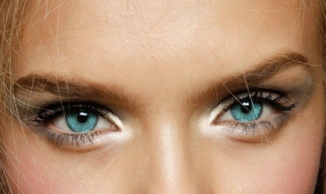
Brighten your Eyes

Make your eyes look bigger and clearer by applying a shadow/highlighter (such as white, silver or peach) on the inner corners of your eyes. This will instantly make you look more wakeful and give you the appearance of bigger eyes. You can also put in eye drops to give your eyes a whiter look (obvious, but we forget).

highlighted-inner-corner-tear-duct-e1366352467649

Use Black Mascara & Liner

If you usually apply brown mascara or eyeliner, go for black. The darker shade will add more definition, making your eyes stand out, and your lighter features pop when the flash does. Tip: try a set of false lashes. They look breathtaking on camera!

Wear Blush

Without blush your face can look washed-out and plain in a photo. To avoid this, lightly apply a warm rose, pink, peach or coral shade to the apples of your cheeks, starting from the point below your irises and working out to your temples. (Don’t go any closer to your nose, as this can make your eyes look close-set.)

By wearing the blush high on the apples of your cheeks, your face will appear more striking and youthful – the higher the blush, the younger you look – as well as add definition to your face. Try using a cream bush (it looks more natural than powder), blending it with your fingertips.

Sculpt your features

Create further contouring effects by using a bronzer that has zero shimmer, fewer orange tones, and is one or two shades darker than your natural color. Then hit the hollows of your face by starting at a point parallel to the center of your ear and stroking the color downward with a face brush (I like MAC’s 188 Small Duo Fibre face brush) toward the outer corner of your mouth. Next,blend upward to soften the line. You can also add some of this countering powder under your chin, along the sides of your nose, and on the outer parts of your forehead.

Give Good Face

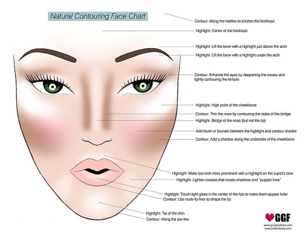
Further emphasize your bone structure by applying a highlighter on the parts of your face that the light hits. But you MUST highlight strategically. The camera’s flash can make objects visually recede, and this will leave your features looking flat. So only highlight with a touch of shimmer, as this will make the light to bounce off in a way that creates depth. If you don’t keep it light you will also risk an oily or washed out look. I suggest using a cream or a fine, shimmery powder and blend well.

The places to target: below your brows, along your cheekbones, right above your Cupid’s bow, and on the bridge of your nose – starting between the eyes and brushing color about halfway down your nose.

Other than that you want to use mattes (flat colors with no added glitter or shimmer) on your face, which do not have any glitter or shimmer. Opt for powders with a yellow hue, which will work to make skin appear soft and silky.

Apply Lipstick

Always wear lipstick in photos. Not wearing it will make your mouth blend in with the rest of your face because there isn’t enough contrast, so you need to make your smile stand out! (Bottom line – always contrast your features for best results.)

Matte or slightly shimmery lips are best. A super-glossy finish can make your lips look drippy or waxy. And avoid taupe and brown lipsticks. I really like a bold pink lip.

Foundation + lip liner + lipstick + powder = perfect matte lips

First blot lips with foundation, then define them by outlining the outermost part with a lip pencil to emphasize the shape of your mouth (this will make your lips look larger and fuller), add a layer of your lipstick, and finally pat a translucent powder for a cool matte finish.
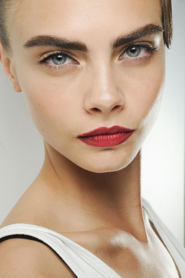
strong browsStrong Brows

Strong brows that are full and dark were once again seen all over the fashion runways this season. This fuller shape is great because it draws attention to your eyes.

If you’ve been a little tweezers-happy or have naturally lighter brows fill them in by (1) combing your brow hairs down to find your natural shape, (2) making short feathery strokes with a pencil that is one shade darker than your natural color, and (3) brushing a brown or taupe shadow over them for a smooth, shadowy finish. Then set them with a brow gel. Or, another good grooming device is hairspray misted onto a toothbrush. It’s not sticky, it gives pretty shine, and its east to comb through.

Tame flyaways

Finally, natural light or a camera flash picks up flyways. They are distracting in a photo. Use your hairspray!

Screen Shot 2013-05-13 at 5.34.54 PM

Filed Under: Latest News, Photo of the Week

Chaps – The History Behind The Fashion

June 15, 2013 by admin

Chaps, the seatless pants coverings most frequently associated with cowboys, originated from the Spanish. These sturdy leather coverings were called armas – which meant “shield” – and used as protection against cactus, brush and thorns when herding cattle.

Basically they were two large pieces of cowhide that attaches to the horn of a rider’s saddle and were spread across both the horse’s chest, as well as the rider’s legs. They served their function well, but were bulky and hard to work with. As such, this early and rather cumbersome design was modified, becoming more portable by placing the cowhide garment entirely on the rider.

Viola! From this Chaperajos were born!

The Spanish brought chaperajos – a word meaning leather breeches or “leg of iron” – to the Americans when colonists from that country started establishing large ranches in Mexico, Central America, and the southwestern areas of North America that eventually became California, New Mexico and Arizona.

Abbreviated to “chaps,” and pronounced with a “sh,” rather than “ch” sound (“shaps”), the Spanish-style leather leggings were tailored to fit local climates, terrains and hazards as the cowboy population expanded throughout the west.

The first version was “shotgun chaps.” This is the plainest style of chaps and the simplest design. The seamless leather pants came to bear this name due to their shape that reminded people of a double-barreled shotgun. Popular from the 1870’s thru the 1890’s, they were generally held together by a belt that fit straight across the waist, but because of their closed legs and skin-tight design, they were difficult to put on or take off while wearing a pair of boots and spurs. (Later on, however, shotgun chaps began incorporating full-length zippers along the leg.)

Angora (or Wooly) chaps also became popular in the late 1800’s, but these were designed to protect northern cowboys in colder and wetter regions such as Montana and North Dakota. Made from hides with the hair left on from a variety of animals – including bear, buffalo and Angora goat – these chaps were warmer, and the natural oils in the fur repelled the rain and snow.

A third adaptation appeared in the early 1900’s, called batwing chaps. These chaps fit the body like shotgun chaps from the waist to the knees, but were modified to flare out in a winged shape at the bottom to provide greater freedom of movement and ventilation in warmer climates. Today, they are very popular among rodeo cowboys for the fact that they accentuate the ride of the cowboy on bucking horses and bulls.

kayli

Although chaps are no example of a cowboy’s good fashion sense, in the show arena they can be for you! As time has passed designs have been re-modified for purely stylistic and decorative purposes. No longer just boring brown, Show Season can make chaps in any number of flashy colors to complement your and your horse’s coloring, as well as embellish your chaps with fringe, studs and crystals – combining the time-honored function chaps were created to serve, with wildly decorative fun.

Screen Shot 2013-05-13 at 5.34.54 PM

Filed Under: Latest News, Photo of the Week

Suit Your Horse – Fabric Colors That Flatter Your Horse

June 1, 2013 by admin

It is going to take more than a decent turnout and an all-right ride to win the deep classes this year. Every aspect of your performance and presentation has to be perfect to create a winning impact in the show arena. But when dressing for success, you have to start at the basics: selecting show outfit colors that jibe well with your horse’s coat color.

Elementary as it may seem, your color choice plays an integral role in the impression you make in the show ring. A color scheme that is both unique, and compliments both you and your horse’s coloring, helps you two to look like a harmonized team. And by picking a color that is also on trend, you will look smart AND fashionable when you hit the arena.

But what are the “in-trend” colors? This season, designers color choices have tremendously addressed consumers’ longing for personal expression, balance, and necessity to re-energize. According to PANTONE (the global authority on color) the 10 “in trend” colors that have been constructed around these powerful needs are Emerald, Dusk Blue, Tender Shoots, Grayed Jade, Lemon Zest, African Violet, Linen, Monaco Blue, Poppy Red and Nectarine.

I personally love the mix of bright colors and neutrals found in this color palette. In choosing your show outfit they allow for practical yet fresh combinations, as well as self-expression, while at the same time, commanding attention and appreciation.

Use this guide to help you determine what (in-trend) colors look best with your horse:

Horses with red in their coats –

Earth tone colors such as rust, sand, cream, peach and chocolate are all flattering base colors on these horses. This color palate spans to include the in-trend color Linen. As a warm neutral, the airy color is subtle, sweet and stunning when worn with Grayed Jade or Dusk Blue. A fabric in copper nude – another HOT color – is also a perfect color choice for horses with reds in their coats.


Bay, Black, Grey or White Horses
–

For riders with bay, black, gray or white horses, embrace a spectrum of bright, bold jewel tones. Such as this seasons bold and rich Monaco Blue. Pair Monaco Blue with other in-trend colors such as Poppy Red and Linen, or Emerald for a crisp and sophisticated look. Or, for a more subtle blue, go for a cool navy fabric (also in this season). I really like the contrast of a darker (albeit totally cool) color of blue paired with brighter warm-weather colors.teal on gray

African Violet on these horses is also a great statement color choice, and can be incorporated into many surprising yet stunning looks. For example, by coupling this intriguing color with the celebratory and lively shade Poppy Red.

Pale icy tones that sprung up this season would also look super chic on gray and white horses – such as muted grays and silver fabrics mixed with barely there accents or vests – creating a stylish coordination of color with your horse in the show arena.

If You Ride Horses In Both Color Groups –

green suitIf you want a suit that can be worn on any color horse, go for shades of blue/green. Teal, deep greens, sage and Turquoise are flattering on almost any horse, and the popularity of green this year is indisputable. My favorite shades of green that have emerged this season? Kelly green, forest green, seafoam green, spearmint green, and a gorgeous warm-toned olive green.

Pintos –

If you are showing a pinto, choosing a suit color will take a little more effort. You should base it on your horses predominate coat color. If your horse is primarily white, you should go for the brighter jewel tone colors. But if your horse’s coat has less white than color, you should use the predominate coat color to establish what your options have.

Neutral Based Horses –

Neutral based horses – such as a palomino – look great with any of the shades above (i.e., earth tones, jewel tones, blue/greens), depending on the horse’s markings and (of course) the rider’s preference.

And one can never go wrong with a black suit, as this go-with-everything shade looks good on any color horse. But count on a majority of your competition wearing black, so make sure yours is distinctive and special.

And don’t forget, a little bit of shine can go a long way – proven over and over on the Spring 2013 runways. So embrace this trend, for instance, with a metallic saddle seat vest, or chaps with metallic trim!
Don’t overlook the importance of the color you choose suiting you, as well! In the world of fashion in general, one has to be very careful how they select color. It is a basic rule of fashion that dark colors minimize and light colors emphasize, and horse show fashion is no different. To look taller or thinner, go for lighter colors, smaller patterns or vertical stripes. And to look shorter or broader, choose darker colors, larger patterns, and horizontal stripes.

But by and large, fashion is a means to express oneself. It’s about individuality, self-expression and choice. It’s something that you should have fun and play with. So whatever color you choose, it should be one that gives you the most confidence (while still complimenting your horse). It’s extremely important for you to own your look. And in order to own it, you have to be comfortable in not only how it looks, but also how it makes you feel.

Screen Shot 2013-05-13 at 5.34.54 PM

Filed Under: Latest News, Photo of the Week

Haute To Trot – Trend Spotting For 2013

May 15, 2013 by admin

I always believe that one should dress for success. I’m not saying that image is everything, because to be successful in the show ring riders have to put in the best performance; it is, however, a big part. If you ride well, and are dressed stylishly, you will be noticed. And, as horse enthusiasts continue to gear up for regionals and nationals, now is a fitting time to seek out this years most on-trend designs and colors.

When designing this year’s outfit, why not go for one of the leading trends of 2013? Available in all shapes, scales and colors, fashionistas everywhere have been trading in their boring basics for something fiercer – animal prints. More popular than ever, animal prints have been seen all over this year’s catwalks as designers – including DvF, Burbury, and Roberto Cavalli – have put a new modern spin on this timeless trend.

In fact, according to the Chinese Zodiac, this year is the Year of the Snake, so it’s definitely not just coincidence that serpent-inspired fashion has slithered its way onto runways everywhere. From classic leopard to snakeskin – in both traditional and non-traditional colors – explore your own wild side and try wearing this trend in the show ring by incorporating printed or sequin animal print fabrics into your western outfit! Or, Show Season also offers stunning imprinted or laser created leathers that are simulated to look like snake, crocodile, lizard, etc.. Play with these beautiful fabrics and leathers – perhaps creating a bold animal print western shirt, or taking a more subtle approach by using an animal print as decoration on the trim of your chaps or saddle pad, or even wearing animal print boots. The potential for chic-ness is endless!

As fab as this trend is though, to avoid any fashion faux pas, only wear one piece of animal print clothing at a time, and never mix more than one of these prints. While animal print is chic when worn in moderation, one piece is enough to make a statement, and more than one will make a bad one. Likewise, do not mix too many colors while wearing these fierce prints. Instead, the key is to go with one animal print item and build around it.

Another posh fashion trend to embrace this year is emerald! Chosen as Pantone’s color of the year, emerald is “a lively, radiant, lush green… [that] enhances our sense of well-being further by inspiring insight, as well as promoting balance and harmony.” What better way to show off your stylish fashion sense this show season than by wearing this sophisticated and luxurious jewel tone.

Also for those western fashionistas, don’t forget the bling! Show attire is very masculine, and so for women it can really be transformed when feminine qualities are added to it. And, as emerald is most often associated with brilliant, precious gemstones, emerald and crystals are a match made in western heaven.green

Try combining all these trends by wearing an emerald animal print fabric as Show Season has done! Using a green, snake themed fabric, Show Season fashioned this trendy slithering western shirt. And to make it sparkle, they embellished the shirt with hand sewn large Swarovski crystals and emerald stones, in addition gold chain outlining; topping the look off with a crystal chocker.

I asked fashionable rider Leah Marie Miller – who also recently combined both these trends when designing her own green snake skin western shirt – her take on these 2013 styles:

As an embracer of the snakeskin trend, did you know 2013 was the Year of the Snake when you decided on this print for your western shirt, or did you have some other inspiration?

Leah: I had no clue about that when I ordered the shirt! When pulling the fabric my main goal was to find a print I liked that revolved around emerald green… The fact that it was an animal print was just a bonus!

What will you be pairing your snakeskin shirt with?

Leah: I will pair it with black custom Show Season chaps that are trimmed in green and champagne gold with all kinds of crystals.

Would you consider investing in any other animal prints?

Leah: Absolutely. One of my very favorite show shirts is another animal print that’s cream, black, and brown, with TONS of crystals. I have been National Champion twice in that shirt! 

Do you have any tips for how one should wear a trend like snakeskin in the show arena?

Leah: I think pulling off any trend whether you are in or out of the show ring is a combination of confidence and loving what you wear, combined with quality and craftsmanship in the clothing. For me, the more bling the better, and I tend to love feeling like a living disco ball!! I feel the most confident when I jog in the ring with a drape in my rein, and I am sparkling under the arena lights! But that is not the way all people love to dress. I think you just have to love what you are wearing and that is what enables people to pull off a look, whether it’s trendy or classic. I wear what “speaks” to me, as silly as that may sound, whether that’s something with animal print or crystals, or simply a crazy color choice. Wear what makes you feel like the best version of “you,” and pulling off a look like animal print is a breeze.

In your opinion, what does a piece of show clothing need to have design wise to really pop?

Leah: For me it’s about 2 things… Craftsmanship and crystals! A really well made piece of show clothing always stands out in the ring. I have been wearing only Show Season in the arena for over 20 years because of that. You can see the difference in quality as soon as someone enters the gate. And of course a lot of sparkle never hurts…

Fun and stylish, animal print and emerald are fashion trends that never go out of style, and, by wearing one (or both) in the show ring, you can make a bold and polished statement, as well as breathe life into dull outfits. Fashionable apparel that performs well, is comfortable, and fits great is what Show Season is all about; and with show stopping trends like these, which will continue to make a statement beyond spring and summer into fall and winter, they are worth investing in.

Screen Shot 2013-05-13 at 5.34.54 PM

Filed Under: Latest News

A Peek Behind The Curtain: Creating Your Show Season Winning Look

May 1, 2013 by admin

The saying “it takes a village to raise a child” rings true for me when it comes to my horse show experiences. Thanks to the incredible support and shared love for horses of everyone who has had a hand in my journey, my passion for horses and riding was realized as a young child, and continues to endure to this day. From my horse-addicted family, to the guidance of my trainers and mentors, and of course, from the wonderful people at Show Season – who have been styling me in one-of-a-kind suits since I was eight-years-old – I have been able to “keep my fire burning.”

Over these years, going to Show Season has become an annual routine for my mom and me, as we always find time at Nationals to go hang out with Melissa and Patti, and pick out our new suits for next years show season. They are our “go to” place for everything that is chic, stylish, and embellished in show suit attire, and I am convinced that their special attention to detail has been a part of my success. Not only do their fabulous suits help me to pull off a complete presentation on my horses, but they make me feel more confident when I hit the show ring.

Melissa

Moreover, as someone who not only has a deep love for horses, but for fashion as well, the entire event of picking out a new suit – getting fitted, choosing fabrics, trims, colors, designs, etc. – is almost too much fun, and Melissa and Patti go above and beyond to help and give their opinions. My absolute favorite part of the experience, however, comes a few weeks later when a package with a “Show Season” return address arrives in the mail that holds within it my dazzling new suit!

The whole process almost feels like magic! You decide on a few swatches, and then – POOF! – your custom-tailored suit appears on your doorstep. Never once, in my many years of going through this routine, did I get up from the Show Season table and actually think about all of the labor or other people that were involved in making one of my suits. Behind the scenes, nevertheless, is where the magic really happens. Here, there is a large number of people who are engaged in the development of bringing these materials to life in a garment, and, in this way, although when you get up from that table the work might seem over, it has just begun.

For 32 years now, Show Season has brought together the very best team from all over the county to deliver your garments in a timely fashion, and, outside of Melissa and Patti, they have continued to work with many of the same skilled tailors they started with all those years ago. This distinction has given Show Season the stability of quality and consistency that is a standard in all their garments. From a client’s perspective, it is easy to overlook all that goes into the process of creating our garments, as Show Season has mastered it’s art, and makes it appear effortless to the customer. Nonetheless, for this team – from sales reps, to suppliers, to tailors, to pressers – each handcrafted piece involves extensive labor and attention to detail.

The process begins after the materials have been meticulously chosen, when the dozens of measurements that are taken from the client (which ensure a uniquely exceptional fit every time) have to be converted into measurements for riding attire. Needless to say, these measurements are quite different from street wear, as the arms, legs and shoulders of a rider are in atypical positions other than just standing. After this has been completed, the creation of patterns, cutting, and sewing are then fulfilled for each garment; a process that involves HUNDERDS of hours. This is the ultimate in wardrobe investment, and, although it is no small task, the labor involved does make your suit look and feel that much more special, and gives it that WOW factor that Show Season is known for.

The end result is a suit that fits like a glove, is impeccably tailored, and is customized to your own unique fashionista style. Although, in truth, being perfectly outfitted won’t win you red roses, it is important for riders to be well turned out for the ring in order to make a good impression. As such, being beautifully dressed could make all the difference in the world, and, in a Show Season suit, you will at least feel like a champion before you ever even hit the show ring.


☆P.S. Be sure to check back for my new bi-monthly Blog posts, offering a client/amateurs perspective, as well as tips on showing and fashion!!

Filed Under: Latest News, Photo of the Week

  • « Previous Page
  • 1
  • …
  • 7
  • 8
  • 9
  • 10
  • 11
  • Next Page »
  • About Us
  • Contact Us
  • Show Schedule
  • Get Measured

Show Season© 2025